We're committed to making our clients' websites,
portals and other solutions to people with special
needs, including those with visual, hearing,
cognitive and motor impairments.
Designing accessible apps and
websites
As part of our commitment to accessibility, we ensure that all our
projects are compatible. Different components of Web development and interaction work together for the
web to be accessible to people with disabilities.
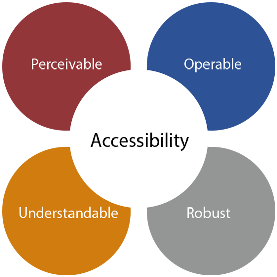
Perceivable
Information and user
interface components must
be presentable to users in
ways they can perceive.
Operable
User interface components
and navigation must be
operable.
Understandable
Information and the
operation of user interface
must be understandable.
Robust
Content must be robust
enough that it can be
interpreted reliably by a
wide variety of user agents,
including assistive technologies.
Create perceivable content
The app or site most likely contains valuable
content, such as product details, instructions, updates, and so forth. But this
content is only useful to people if they know it exists.
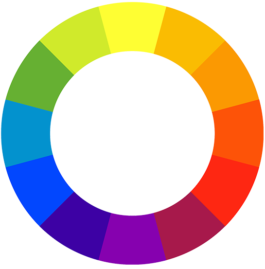
Colors
Color contrast can have a significant effect on
how perceivable your content is. We used the
Material Design Color Tool as a guide.
Highlight
Use more than just color to show
information. For instance, the text
that links to another webpage is
highlighted in blue, but it’s also
underlined.
Headings
We use clear headings and labels -
they make it easier for users to
scan and find the section they
are interested in.
Colour blindness
We use several tests for color
blindness (Deuteranopia,
Protanopia & Tritanopia).
Offer several ways to navigate
Different people will interact with your app or site in different
ways. For example, people with physical disabilities may navigate
sites using only keyboard commands, like the tab key or space
bar.
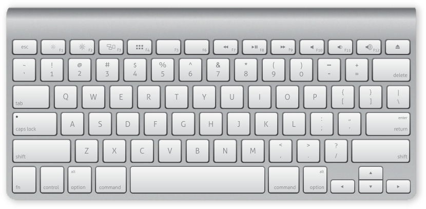
Keyboards
Keyboard navigation is supported,
and links are made descriptive -
links are visually identifiable
and have a clear focus and active states.
Skip
We also prefer providing users
with a way to skip top-level
navigation to access the main
content.
App and website
compatibility
To ensure your app or site are as accessible as possible, we make
sure your site works with multiple browsers and that both your app
and site support a variety of assistive technologies, like screen readers.
Alt text
We add “alt text” to all of your images.
The descriptive copy, written into the
back end of an app or site, enables
screen reader technology to help
users who are visually impaired
better understand images.
Labels
We also label anything interactive,
such as text input fields and icons.
If your site has a navigation icon,
you might give it a label for screen
readers to use, such as “show/hide
navigation menu.”
Brief
When we’re creating labels, be brief
and use lots of verbs. That way,
people using assistive tools won’t
have to listen to long descriptions
and can instead focus on what
action they need to take.
Zoom text
We follow certain standards for accessible
patterns for front-end, and for testing color
contrast and Zoom text level.
Testing
As you're making accessibility refinements
and updates to your app or site, you can use various tools to test the experience
and determine how to improve accessibility further.
Web extensions
There are web extensions you can
use to get a report on your site. For
example, WAVE Evaluation Tool can
run accessibility tests. If there’s a
failure, you’ll be directed to a
document with suggestions for
fixing the issue.
Product check
For products, you can try the
accessibility checker app. Tools
won’t catch everything, however,
so it’s smart to watch actual people
using your app or site.